My Process & The Client
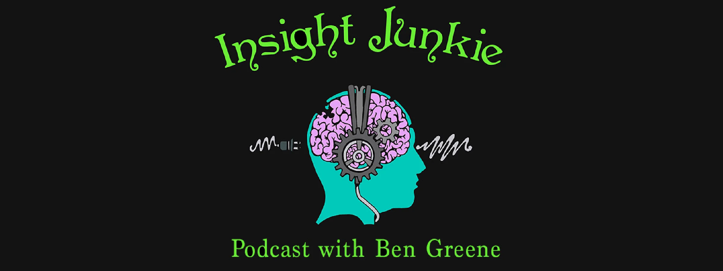
This is a brief step by step breakdown of how I create a logo and brand identity with input and guidelines from a client. If you scroll down passed the text, there is a photo guide of each refinement and draft of the "Insight Junkie" brand and logo imagery. Step by step details can be found below. The following is from final product and logo creation, working backwards through drafts and conception.


As with any logo creation process, I start by speaking with the client and learning what their brand identity would feel like ideally, and who their marketing demographics and target audiences are. Then the brainstorming and outlining begin with pen to paper in an open minded, no filter sketching session.
From there the client gives me feed back into their business or product.
In the Case of Ben Greene -" Insight Junkie" Podcasts, I had been contacted by Ben online due to his love of psychedelic and vivid imagery. He brought examples of my past work and color schemes he liked, then told me that his target audience was college students, intellectuals, tech oriented folks and counter culture members from all the spiritualists, drug users, anthropologists and psychologists with an edgy feel to the whole thing.
He didn't have any committed ideas of imagery but wanted it to communicate the edgy, counter cultural and psychedelic style of his pod casts, but also for it to not look too much like a typical logo or icon. His guiding words were simply, "I want it to look like a trippy, but thought provoking and symbolic laced- rock and roll concert poster that grabs your eye and makes you curious!"
So I sketched about 20 images in pencil as we chatted, then narrowed down the imagery to something including several key elements: The brain, headphones (or the podcast aspect) and a question mark woven into anatomical features of the brain.
He saw a simple black and white first draft without any items around the head, and desired more items and symbolism. I then created a very complex sketch of a question mark with a pill capsule, inputs of sensory elements like music, electricity, sight, knowledge and nature as he listed things he wanted to communicate. Mean while I warned him that we didn't want the image too cluttered or detailed. It needed to be recognizable and communicate a few key emotions of thoughts.
He agreed and finally we whittled down the structural lines to an input and output cord and visual light wave to represent synthetic knowledge learned from society and technology and then our organic, biological- sensory knowledge in, sound waves and photons. Likewise it was to symbolize how we are literally plugged in to technology and it filters how we interact with organic inputs in our consciousness. Lastly I convinced him to edit out the question mark and said that the imagery would be great for a t-shirt or promotional image online, but for a logo it was too complex and busy.
The last major step was to colorize the logo and add text. At first the client was insistent that it be hand illustrated lettering and in a "Woodstock meets cyber punk , DIY " style. Below you can see how I first gave him an incredibly busy, circuit laced and difficult to read font, per his request, but also showed him a true font typeface version and a hand drawn "Woodstock-ish" font I created by hand, edited in photoshop, finished in illustrator.
He agreed that simpler was better, and we again edited the imagery involved to something more contemporary and clear. Lastly I laid out color comps and schemes for him to look through and we settled on one after a few more edits and additions.
After his logo and brand identity centerpiece was created, I then began editing banner ads, facebook, instagram and twitter formatted promotional versions of the logo, as well as laying out the imagery for possible merchandising.
In the end the client is always my priority, but with some projects you must pitch your simplified idea, have it declined and then create their vision of the logo in order for them to understand that less is more. We did this back and forth dance a fair number of times in this project, but as a designer I never take any revisions personally, and try to communicate the client's wishes and brand identity as clearly as possible. If that means doing 3 extra versions of an image or layout, then so be it.
Because with open communication and a clear understanding of their needs, along side my expertise and artistic, and technical skill we arrive at a great logo. The best projects seem to often start in the mind of a client, without a specific artistic vision and then are expanded and edited into something magical and powerful that includes both of our vision and expertise.